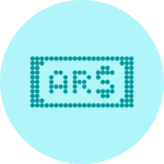
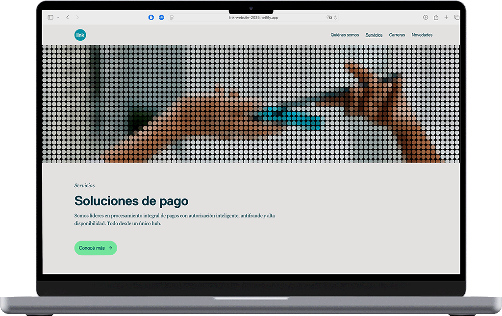
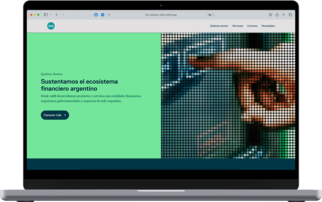
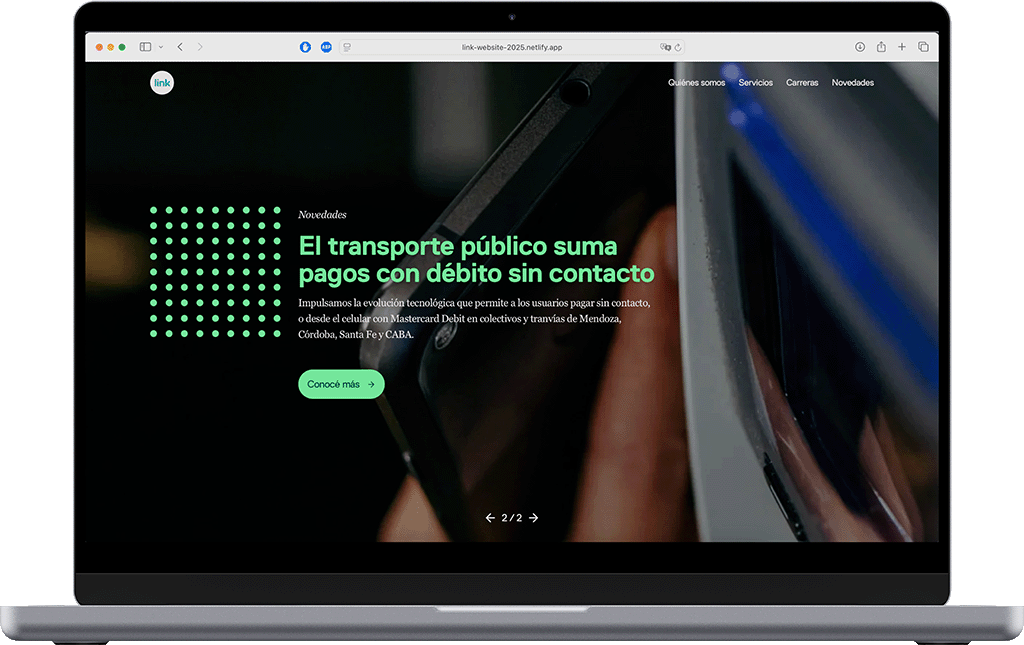
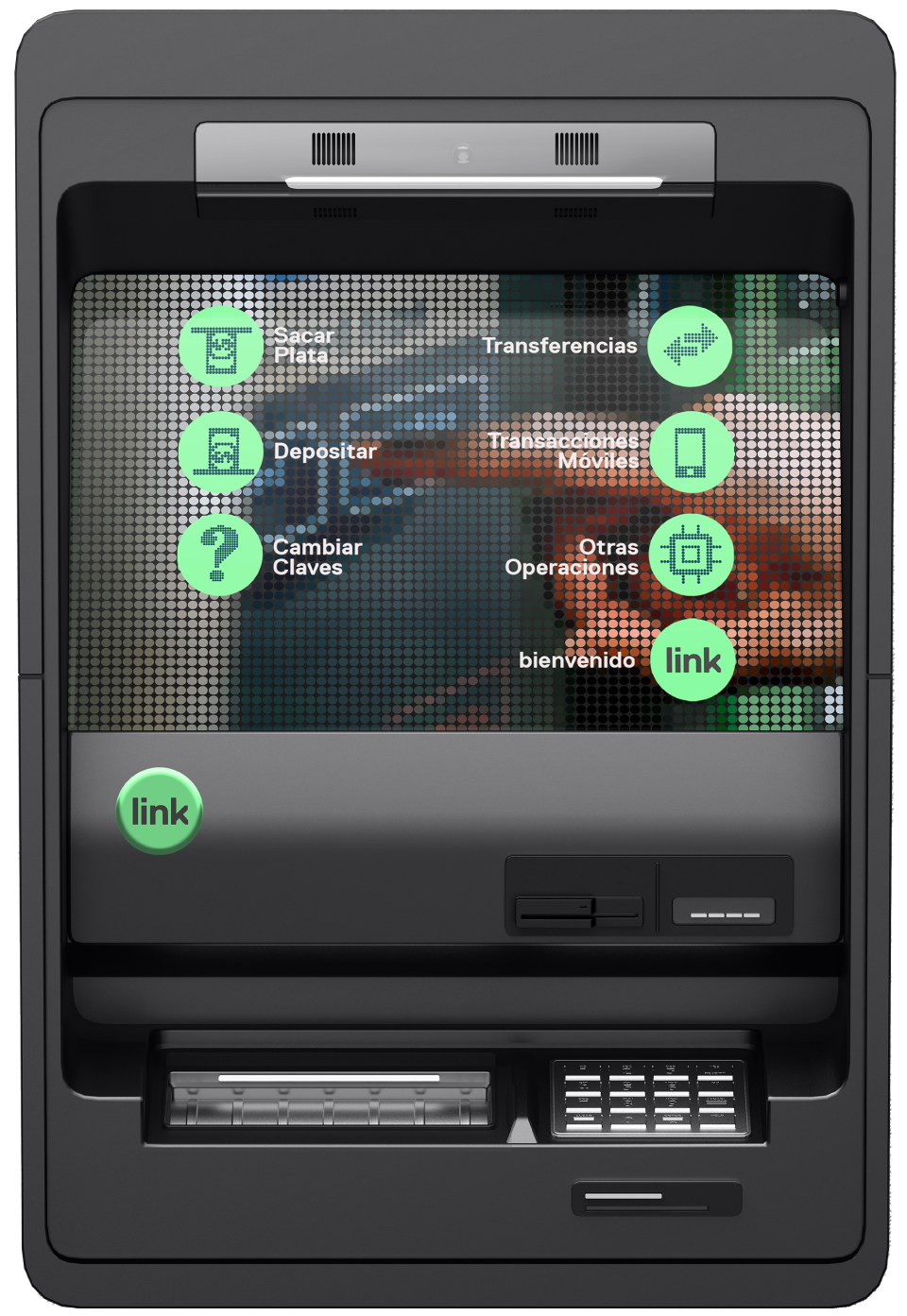
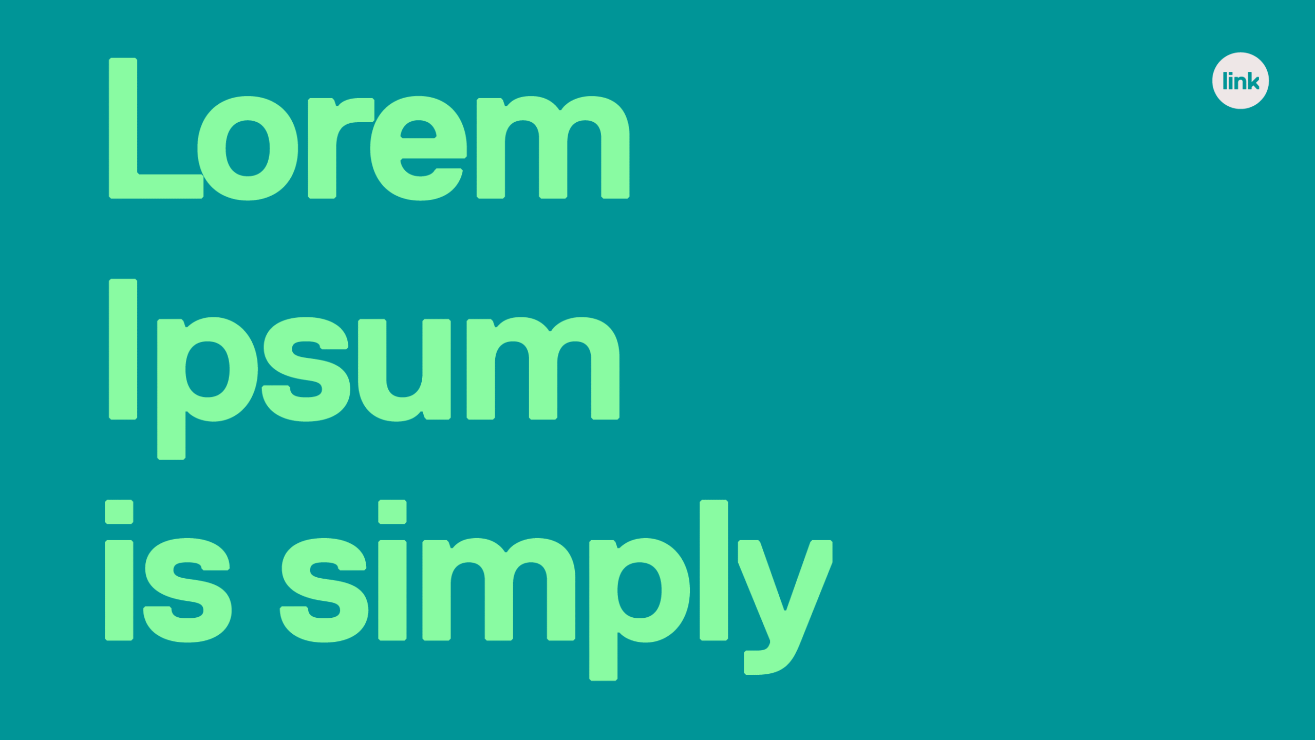
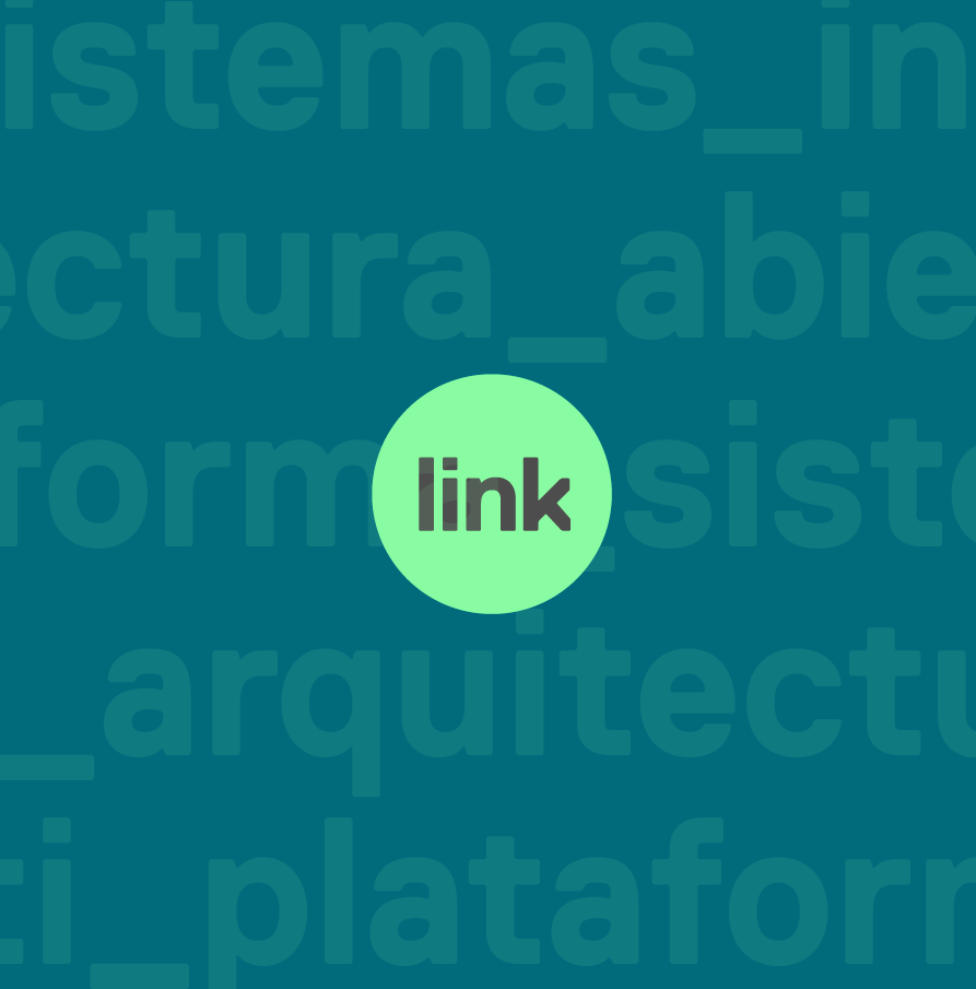
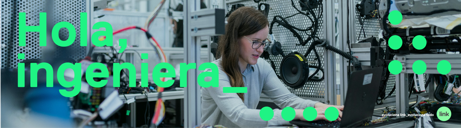
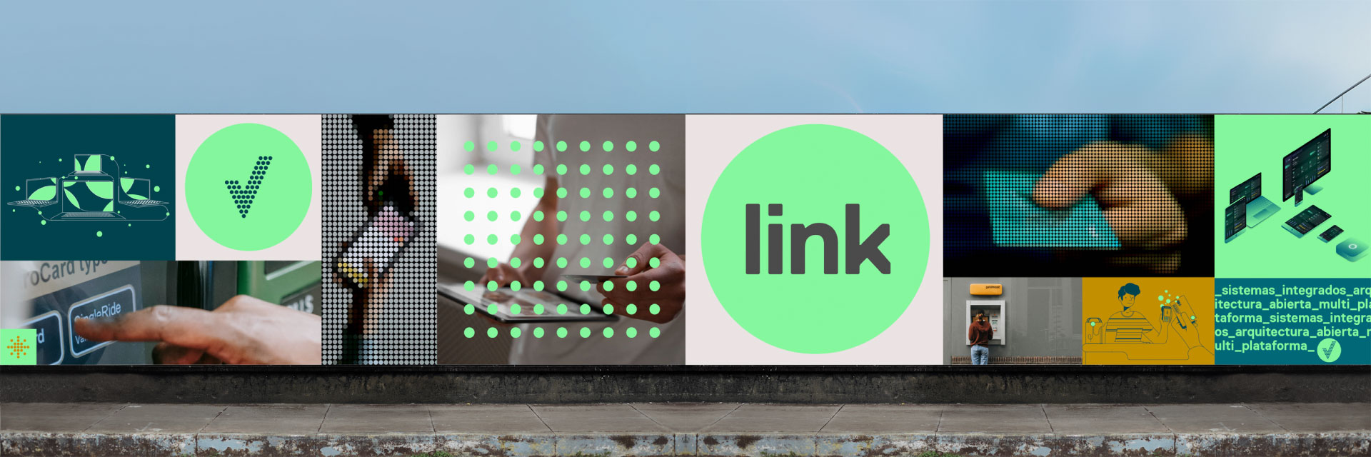
We designed a new logo that retains some elements of the original — the circle, the green background, and the ascending stroke of the final “k” that projects like an arrow — but we refreshed it with a new shade of green, more electronic and digital, paired with an almost-black typographic color. The typeface, Replica LL from the renowned Swiss foundry Lineto (@lineto_com), combines the friendliness of Helvetica with chamfered edges, giving it a distinctive personality and a sharp, contemporary feel.
This project came to us through Ponce Buenos Aires, and it was both an honor and a joy to work once again with Hernán Ponce as creative director.