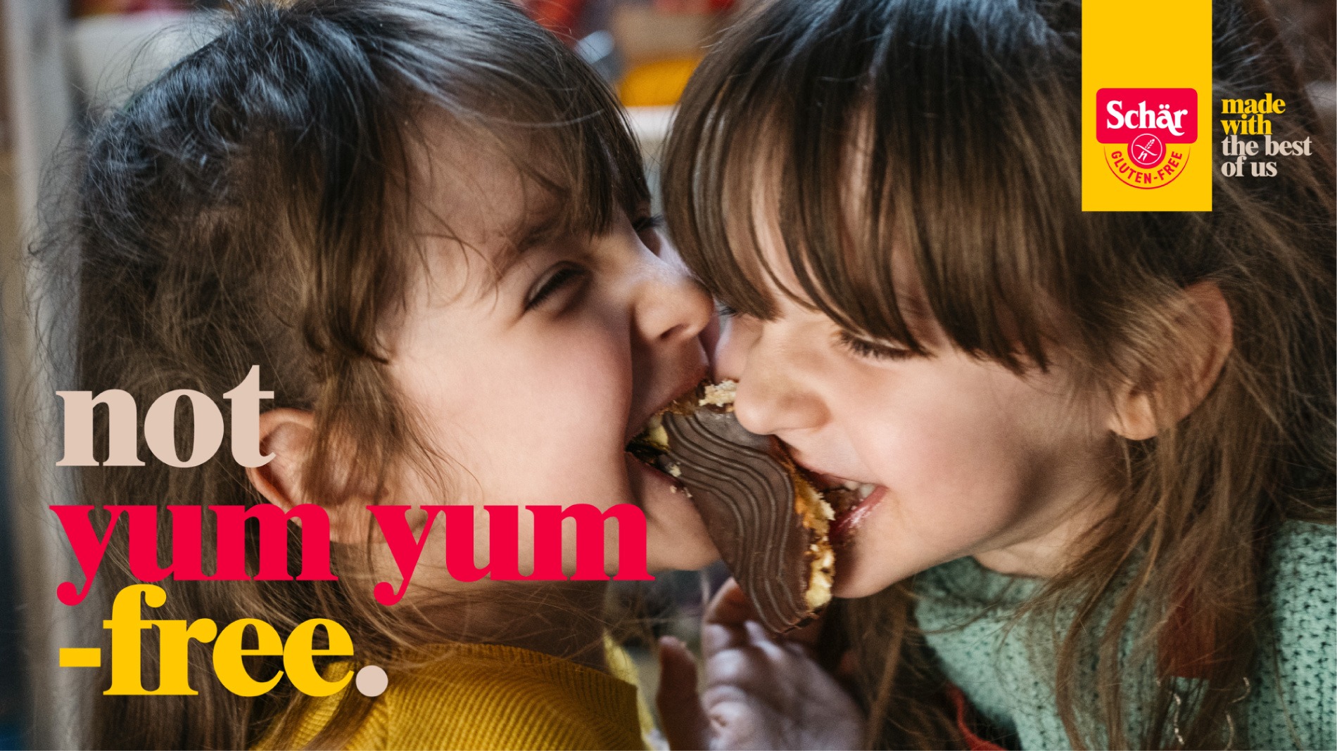
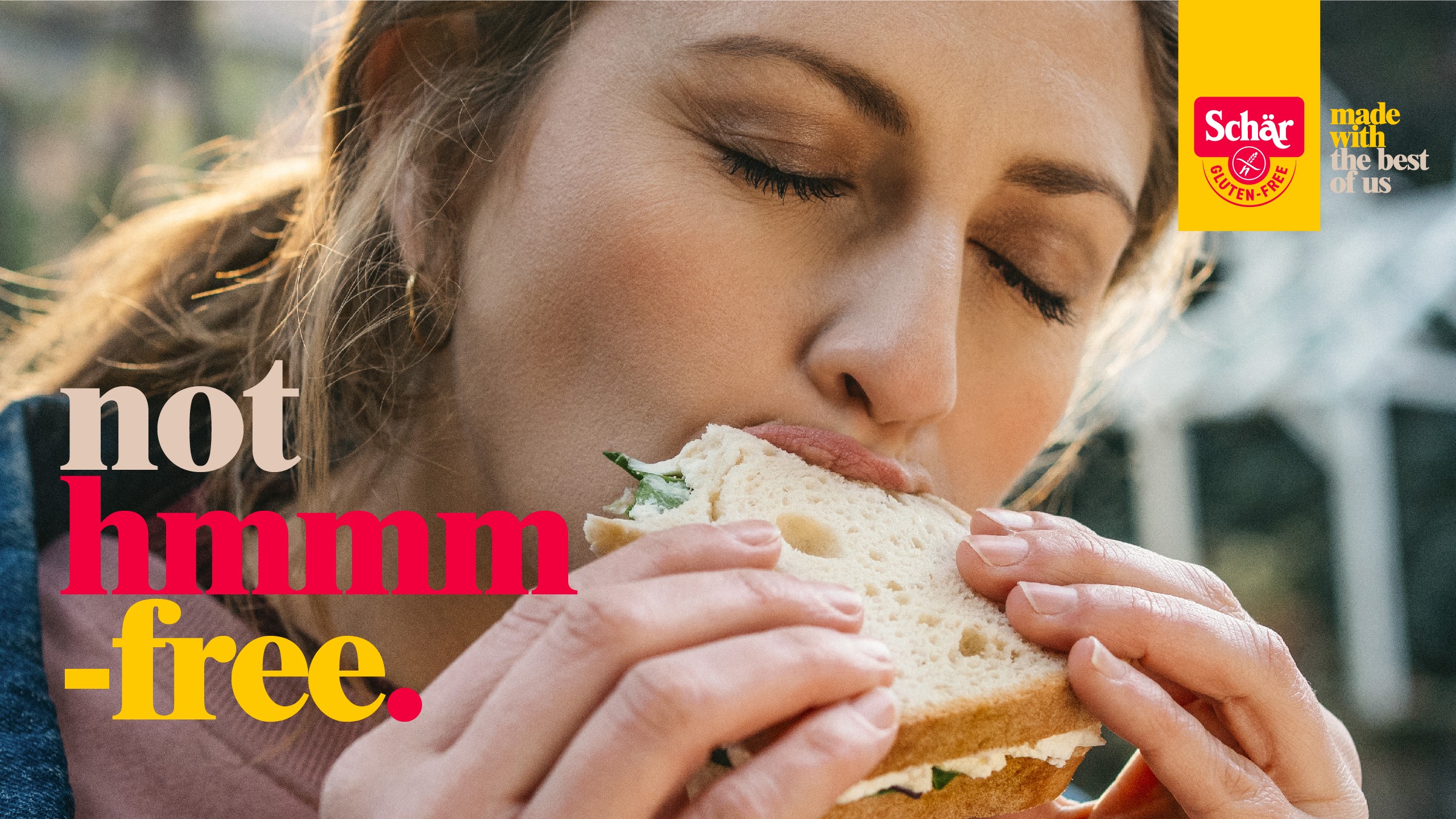
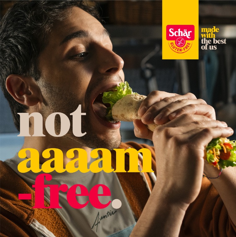
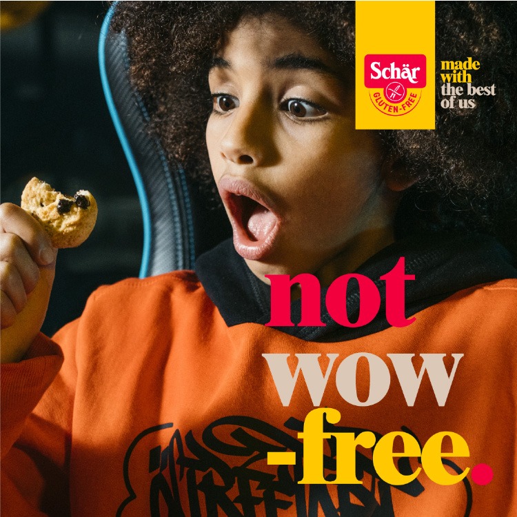
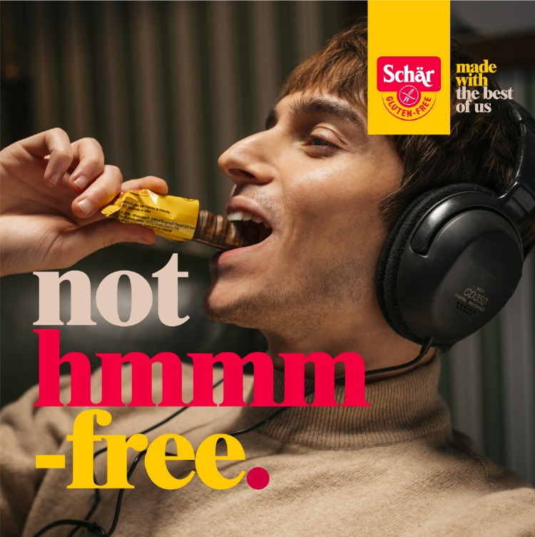
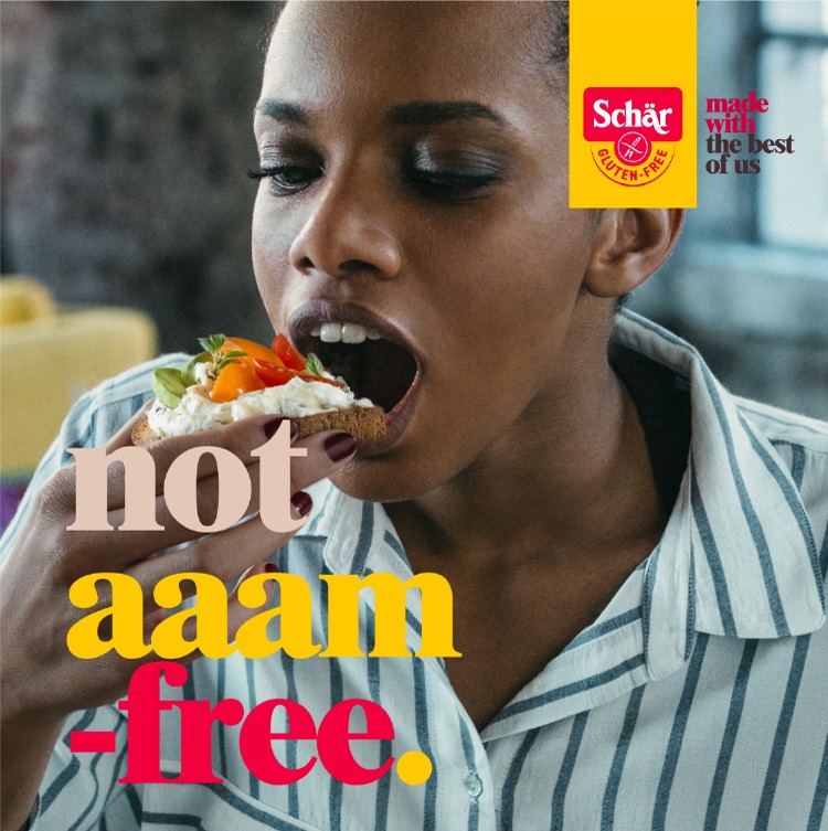
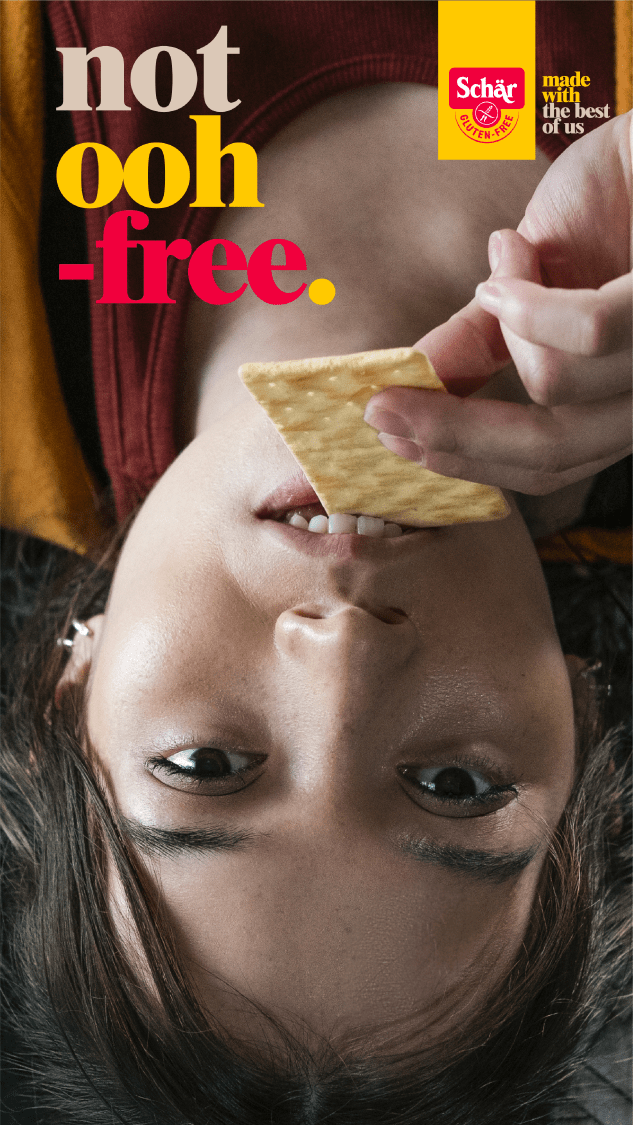
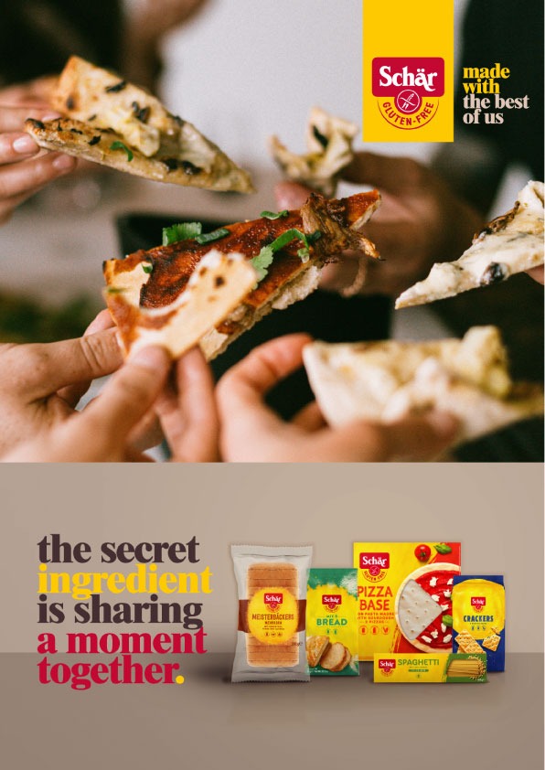
An inclusive brand, even for those who tolerate gluten.
The advertising agency Mercado McCann called us for the redesign of the communication identity of one of its new clients, the Italian company Schär, a global leader in gluten-free foods.
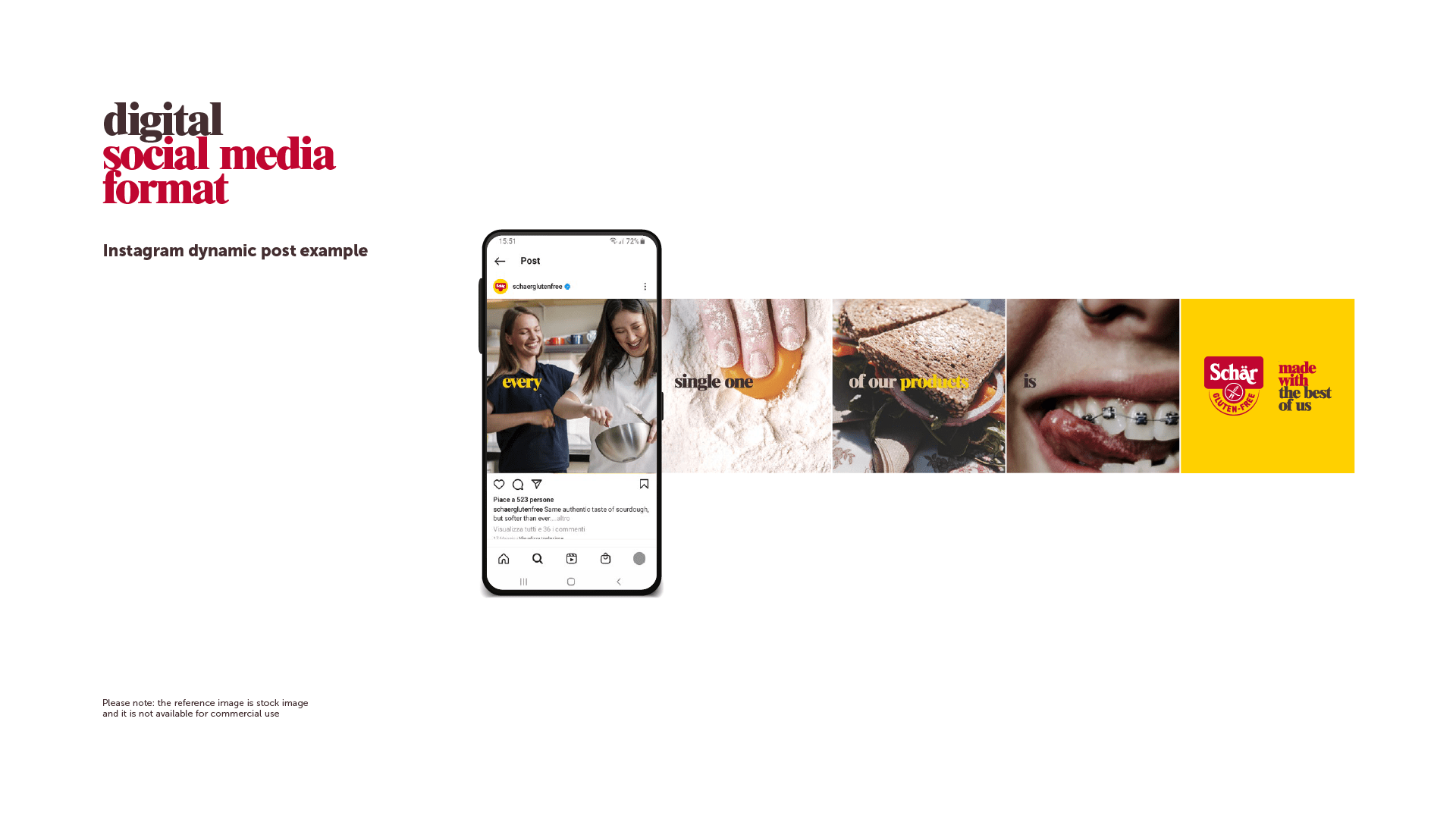
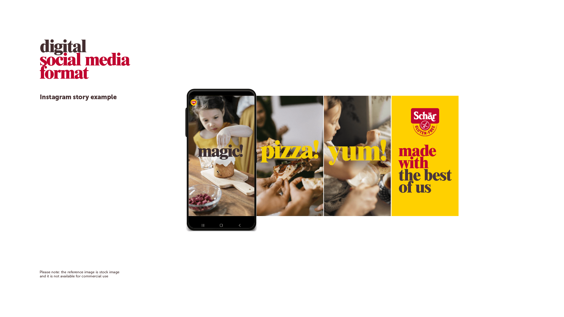
They asked us to create a graphic system for all media—audiovisual, print, digital, and social—that could carry the brand’s new message:
We are a brand that stands for inclusion.
We produce such delicious gluten-free food because we don’t want anyone to be left out. Not even those who tolerate gluten.
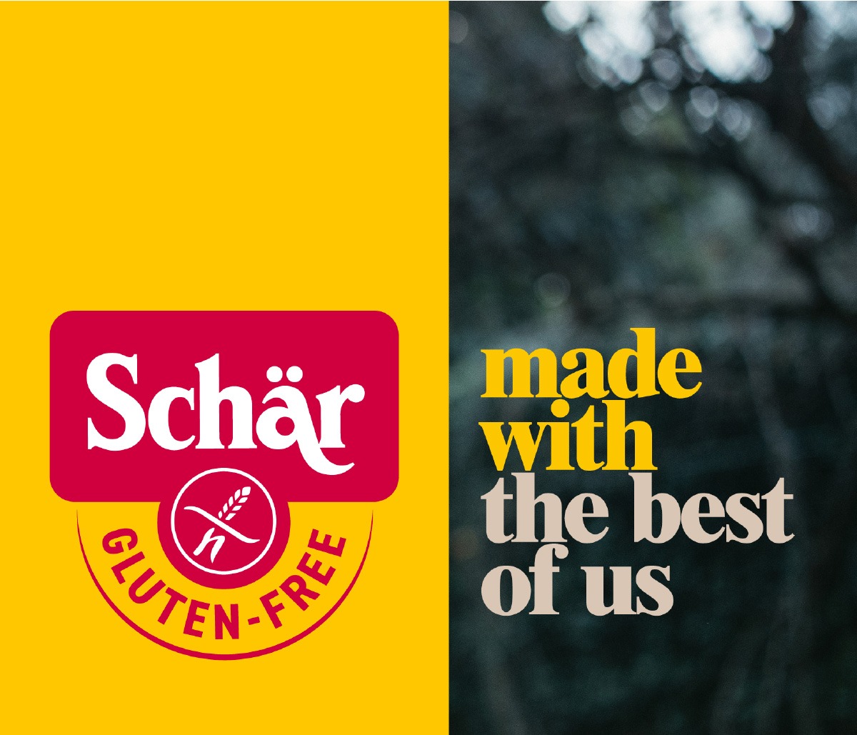
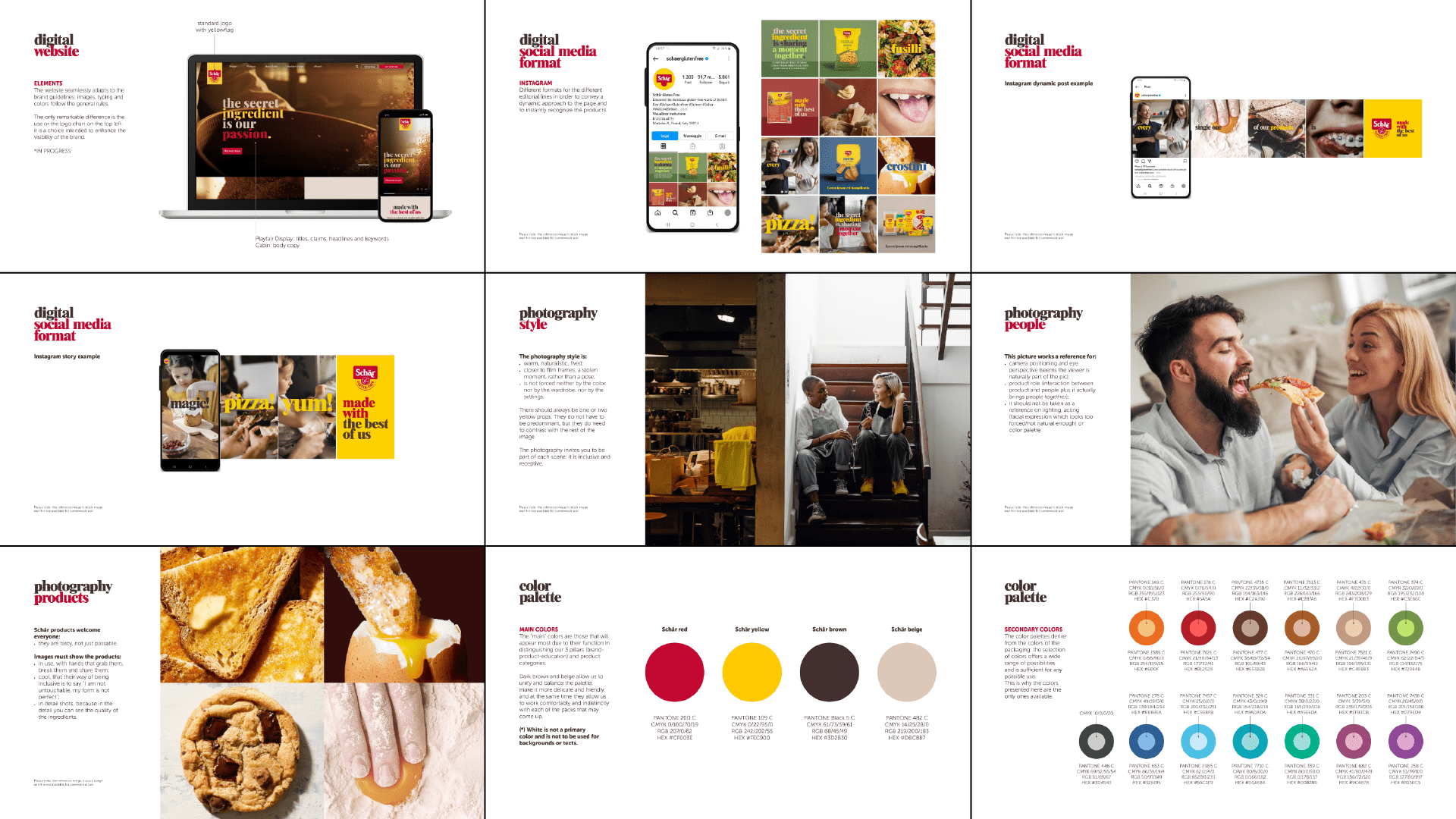
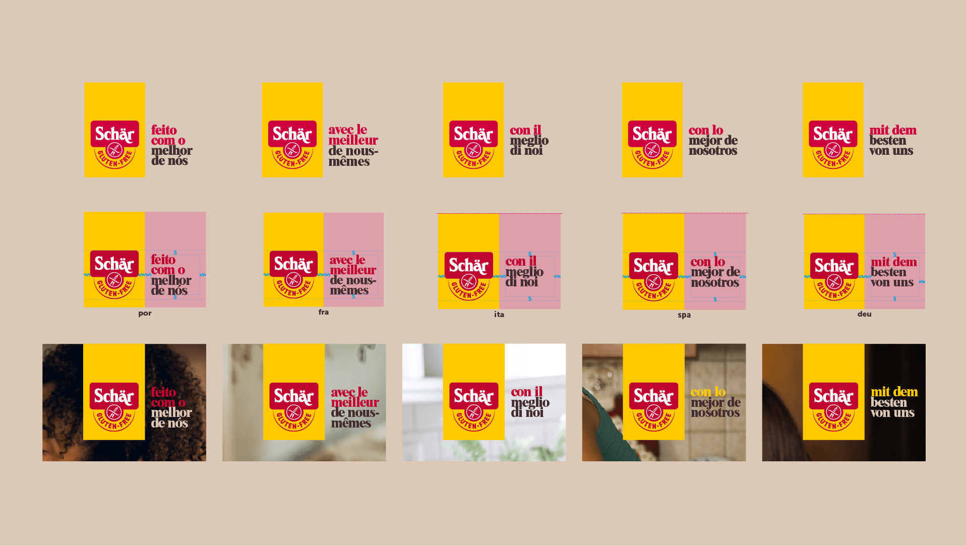
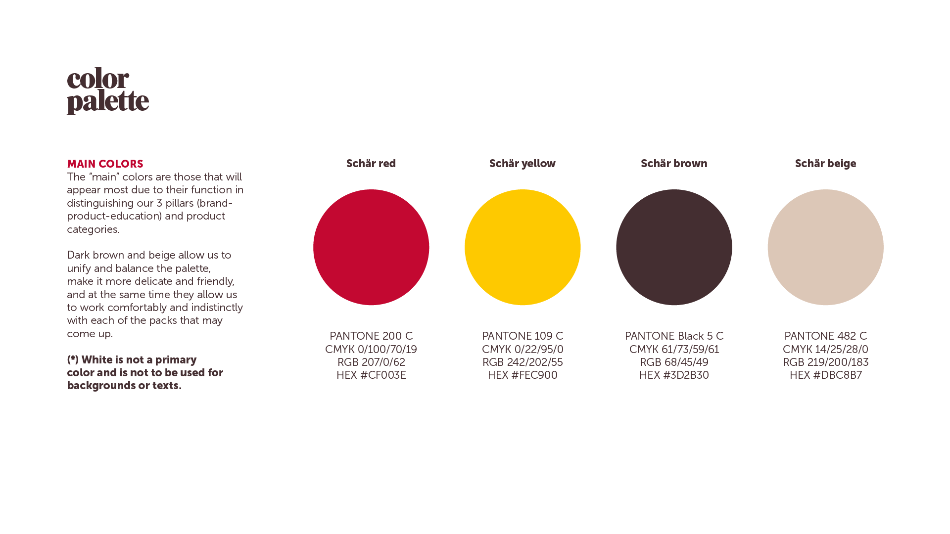
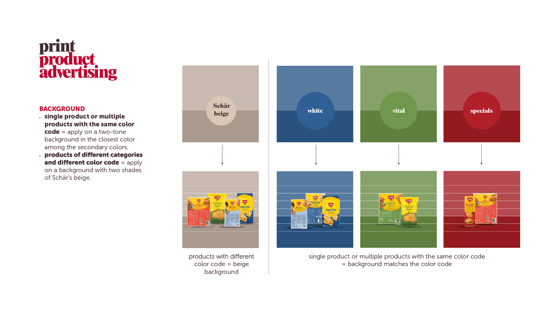
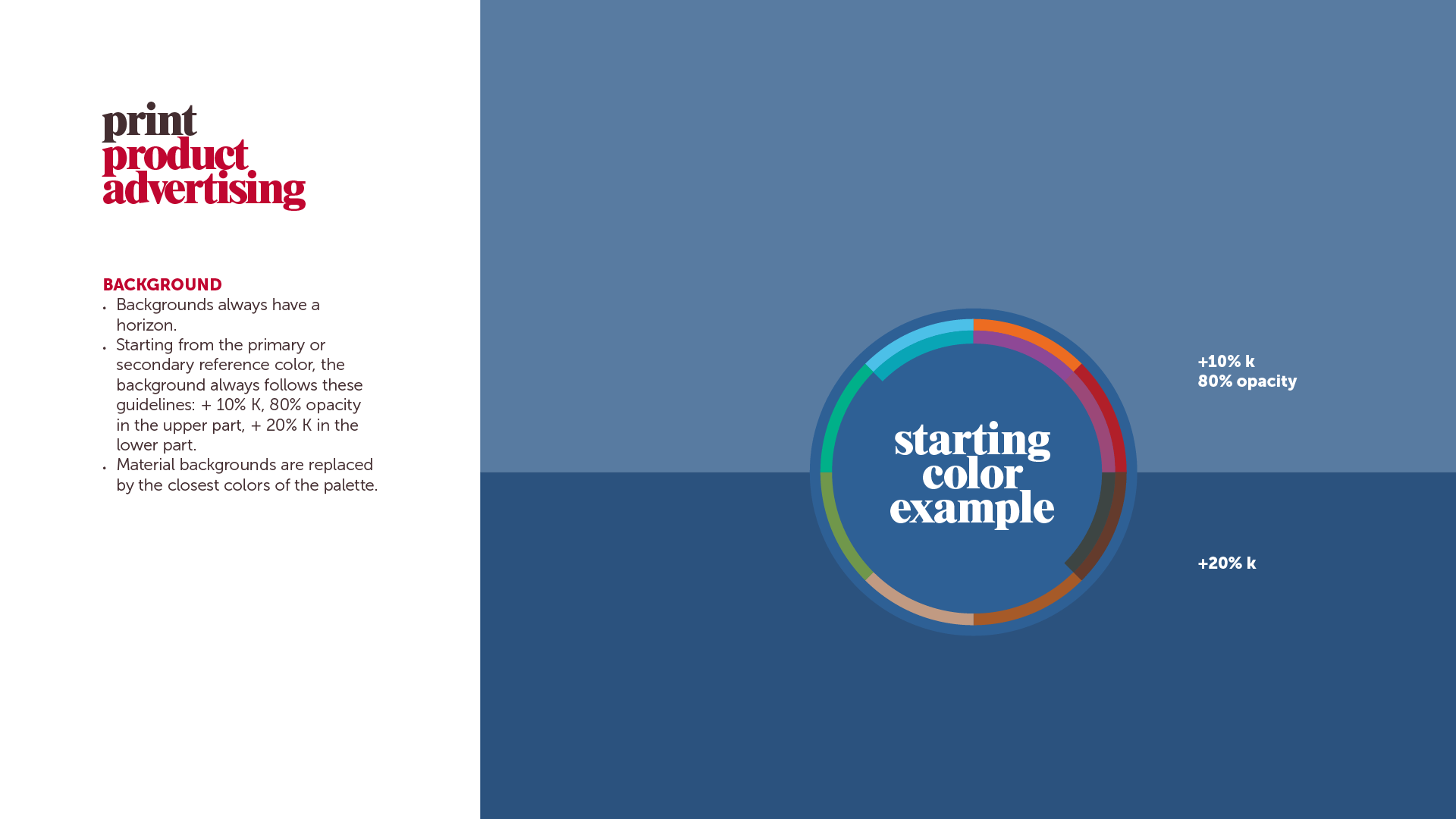
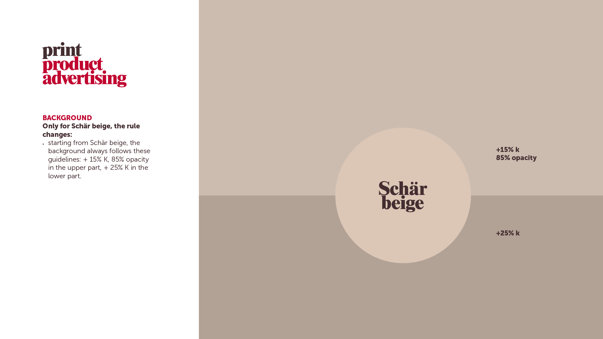
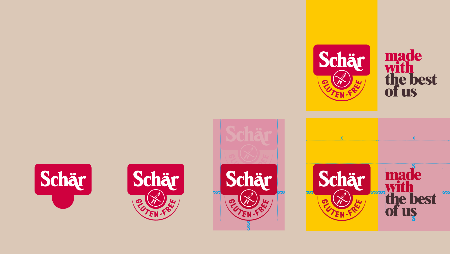
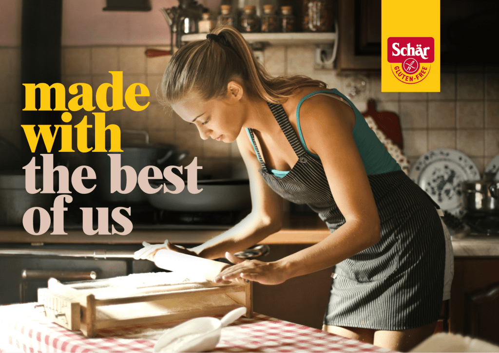
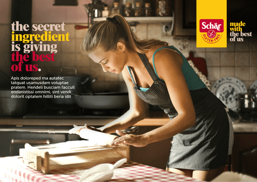
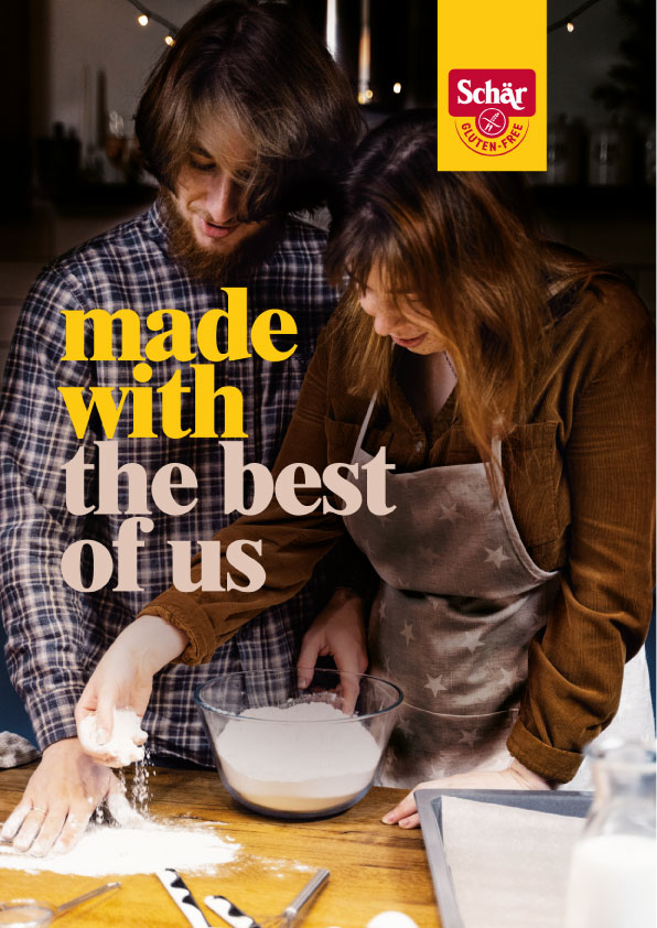
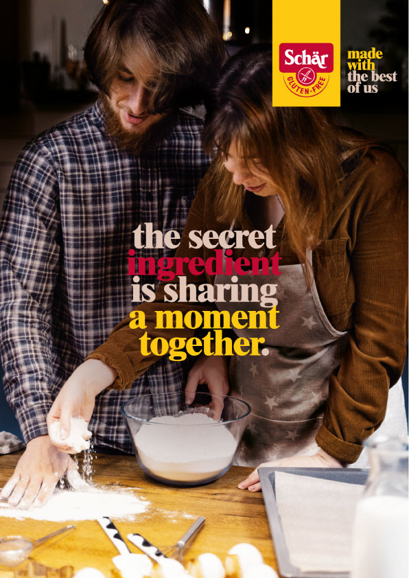
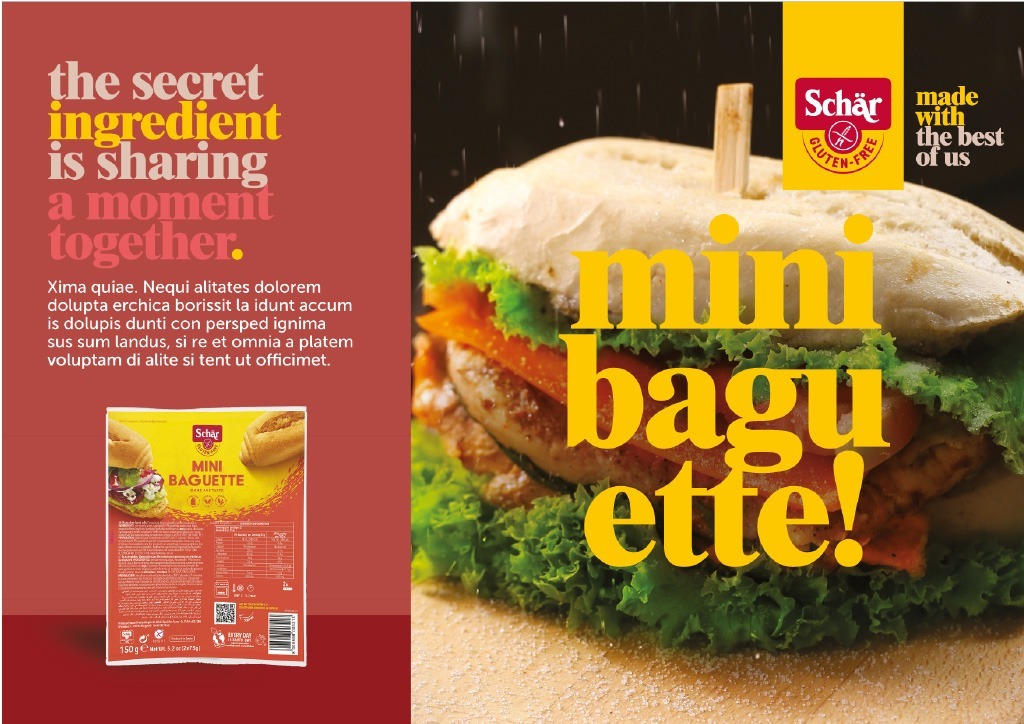
Our initial observation revealed that the association of red and yellow with promotions and fast food contradicted the brand’s intended image. To counteract this without compromising the logo’s essence, our first strategic move was to introduce beige and brown into the primary color palette.
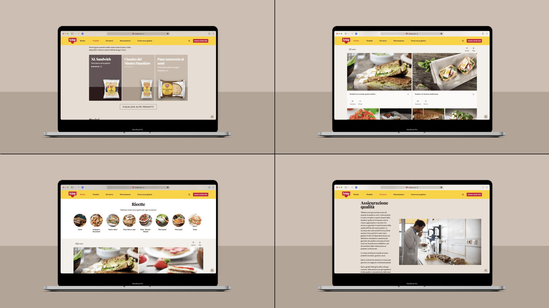
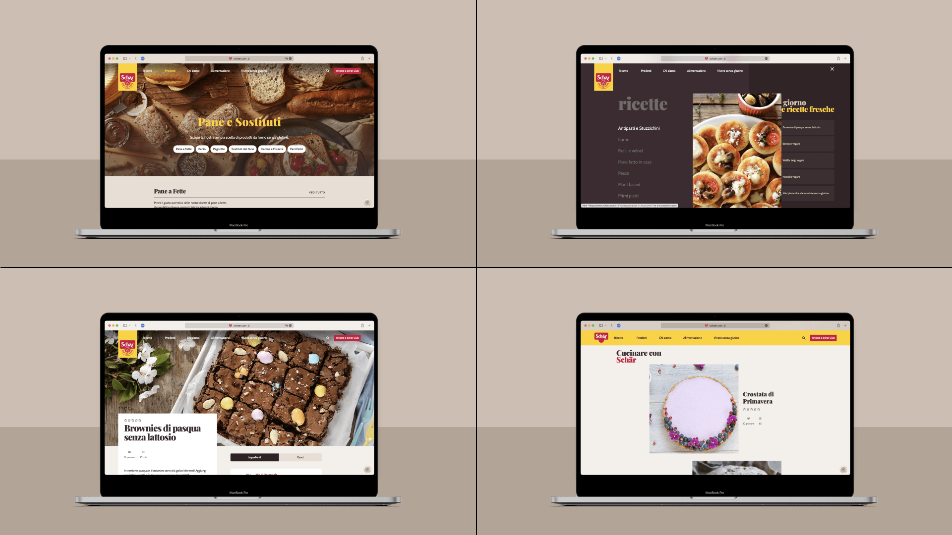
Based on that decision and the strategic definitions of values, personality, tone, and language, we developed a complete visual communication identity system.
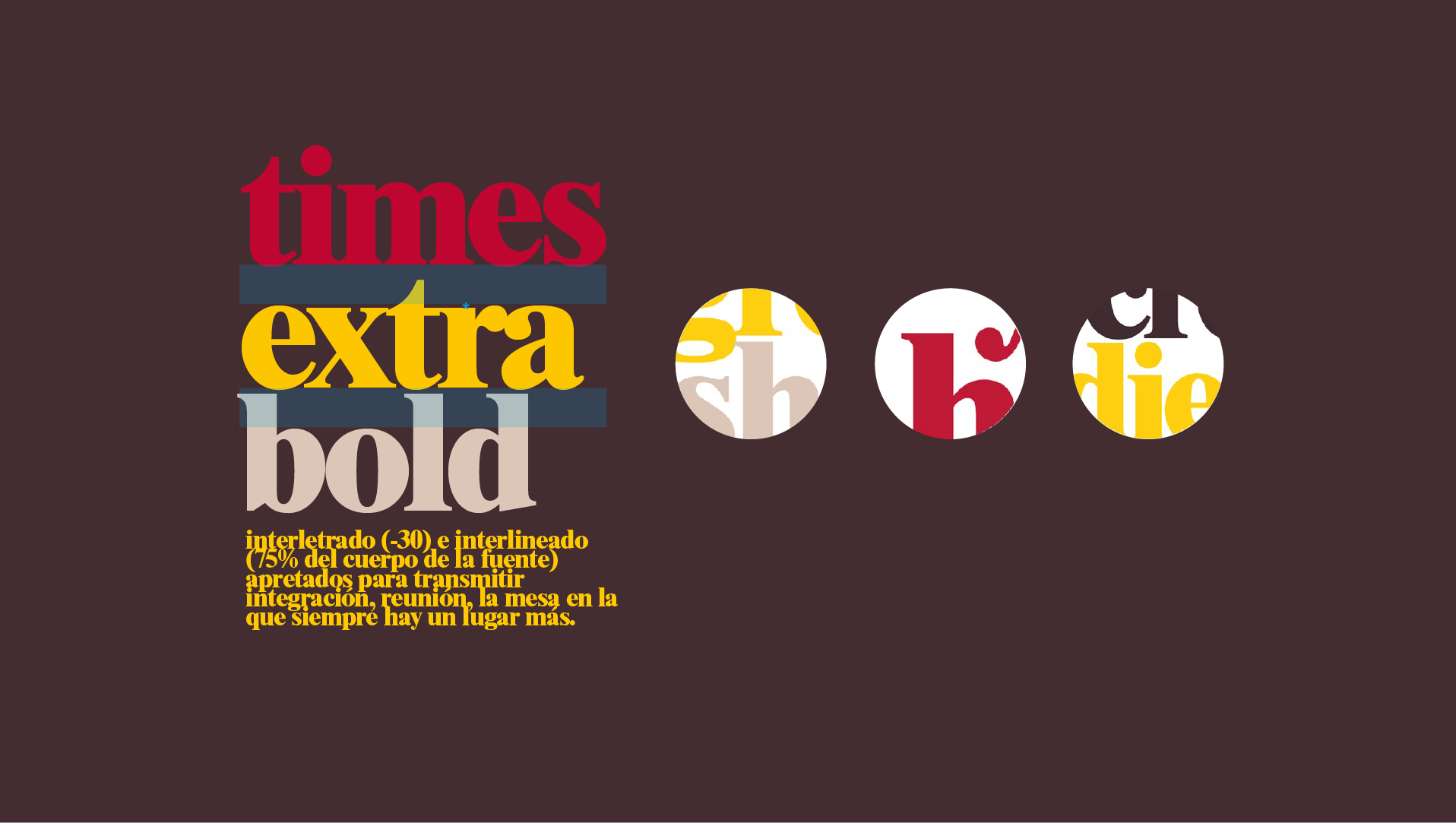
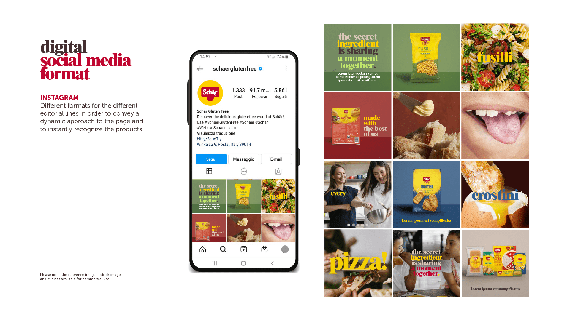
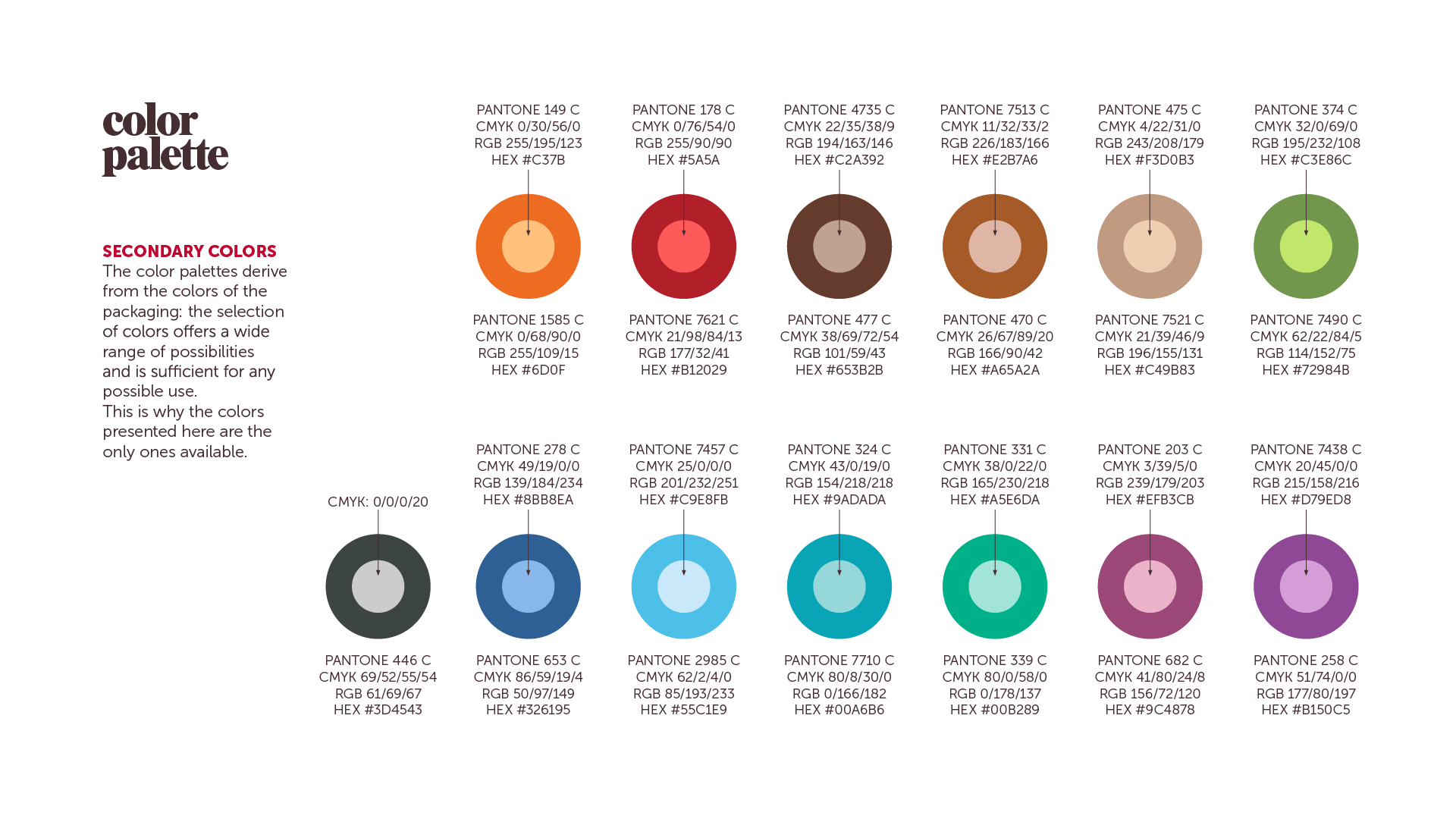
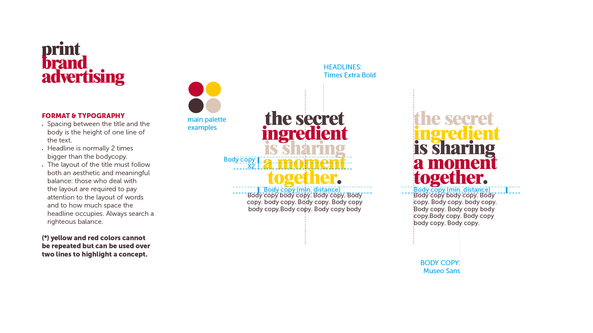
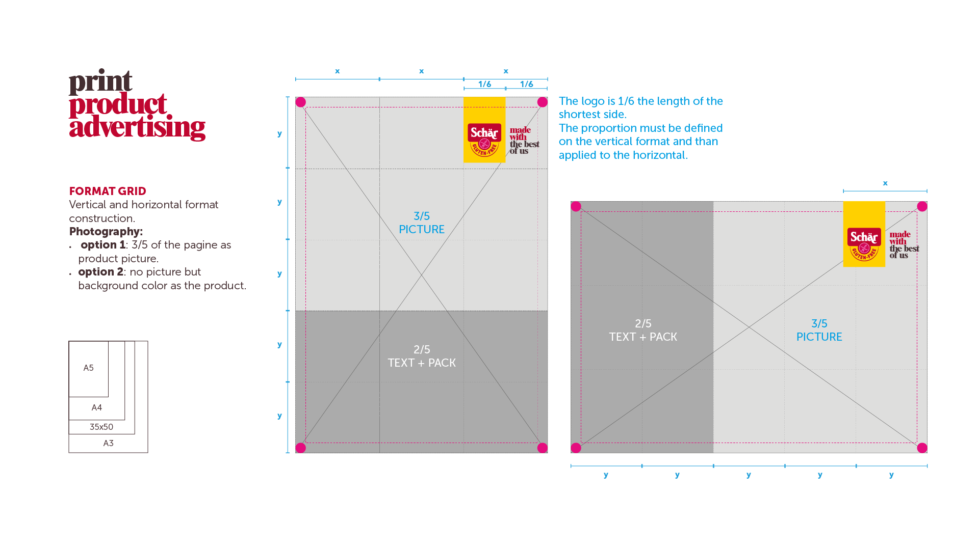
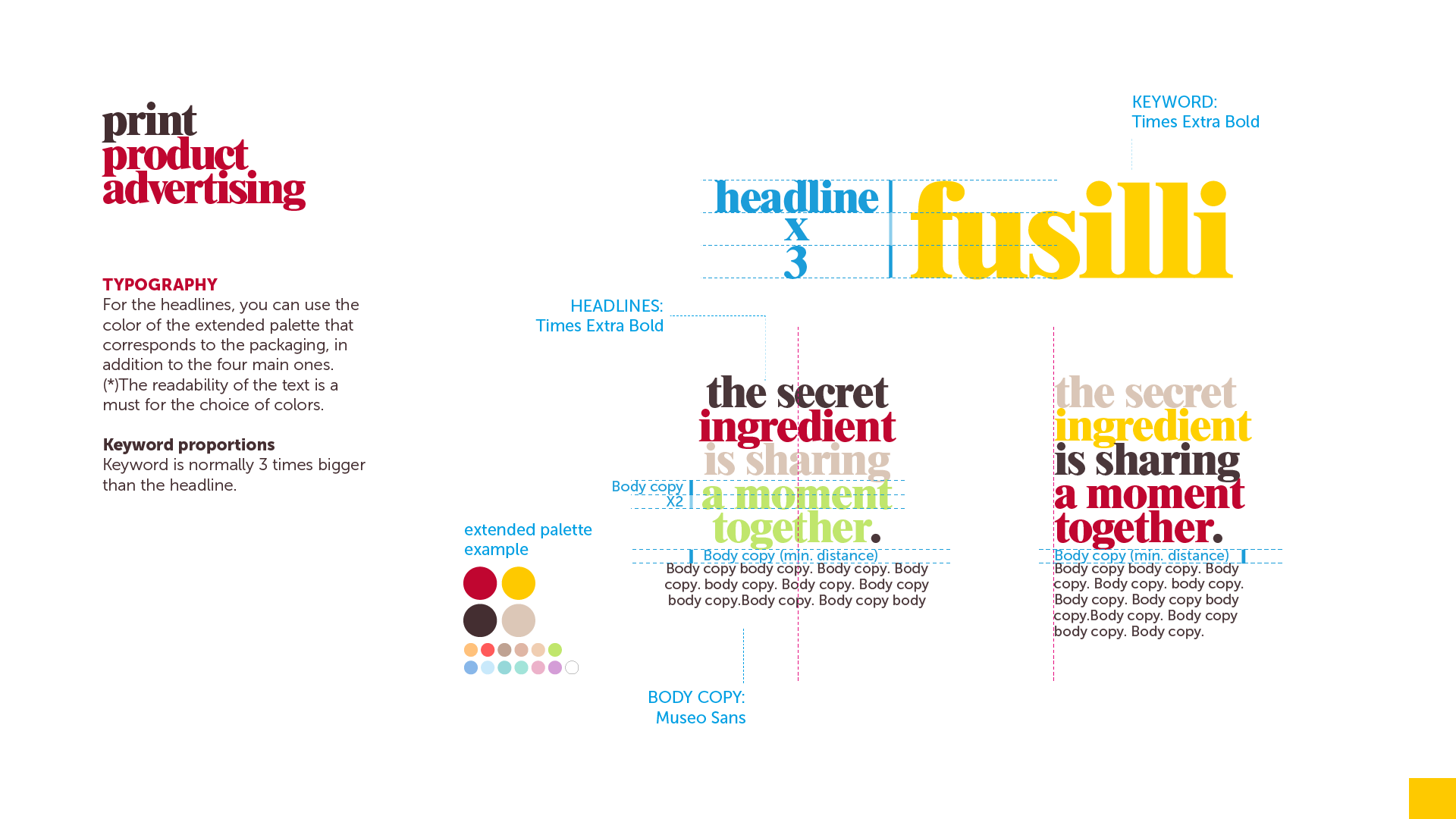
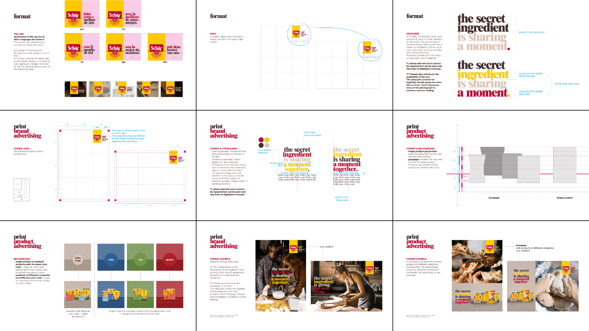
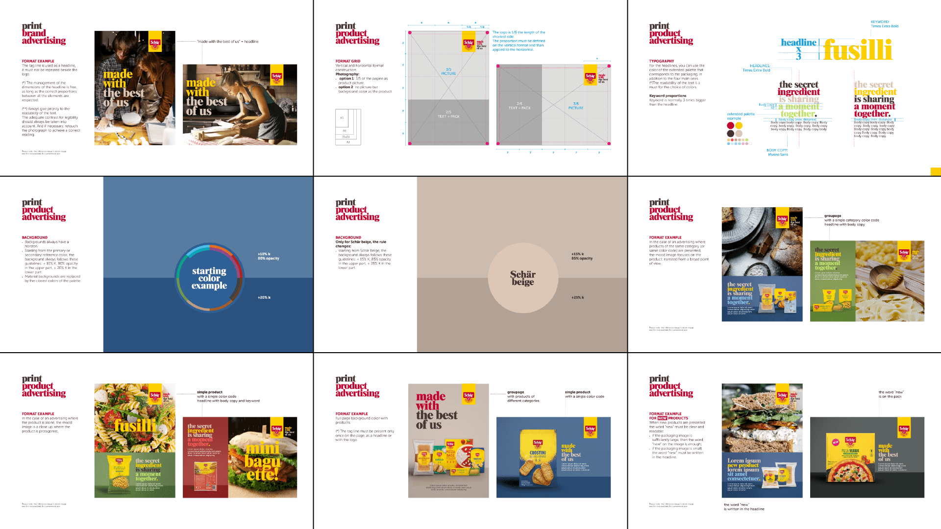
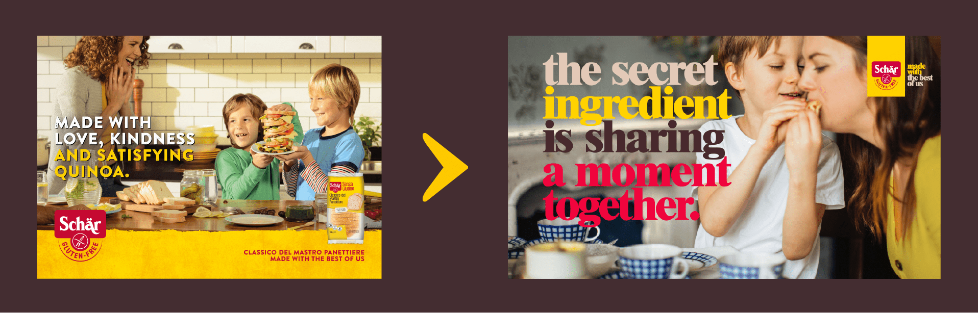
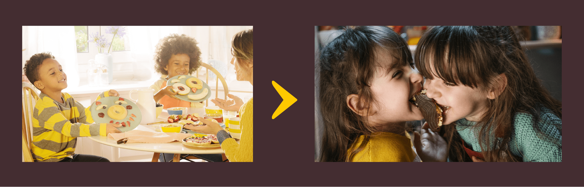
We changed the fonts and their layout (tight and in different colors), established new guidelines for images, both of people and products, and created a new color palette to counterbalance the yellow and red,characteristic of junk food and discounts
The new style definitions removed the medicinal aura and the myth of unpleasant flavors and textures from the brand, allowing it to convey its central idea of inclusion: we all share the same table because what unites us is the taste.